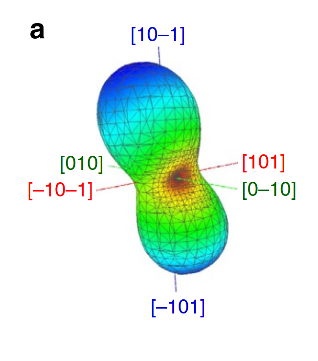
I am trying to write some code to automatically generate a judicious set of graphics from DFT/fn-DMC calculations so that users can sanity check their results quickly. My literature review has found that volume rendering of the wavefunctions is a good first choice, then isosurfaces of constant $|\psi|^2$, and Fermi surfaces where appropriate.
However, many of these visualization routines are computationally cheap, relative to the simulations, so the more ways to understand the simulation data, the merrier.
- What are the awesome graphics you have seen in published literature that gave you unique insight into a quantum system?
- What graphics should be co-produced with each simulation to make life easier for matter modelling practitioners?
Just to get things started:
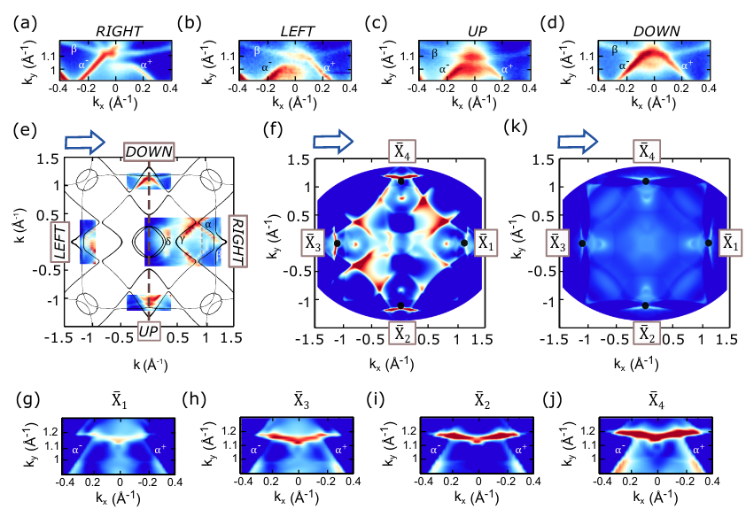
Here is a paper with nice graphics (see Figure 5); it looks to my untrained eye like they are creating "widened Fermi surfaces" similar to the result of ARPES measurements.
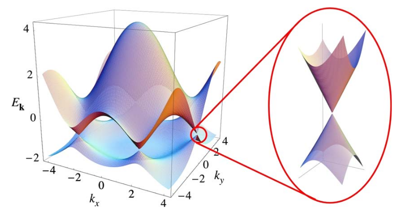
2D systems (e.g. Figure 3) allow some more interesting band structure visualizations; although I imagine this is possible in 3D if we slice through a lattice plane.
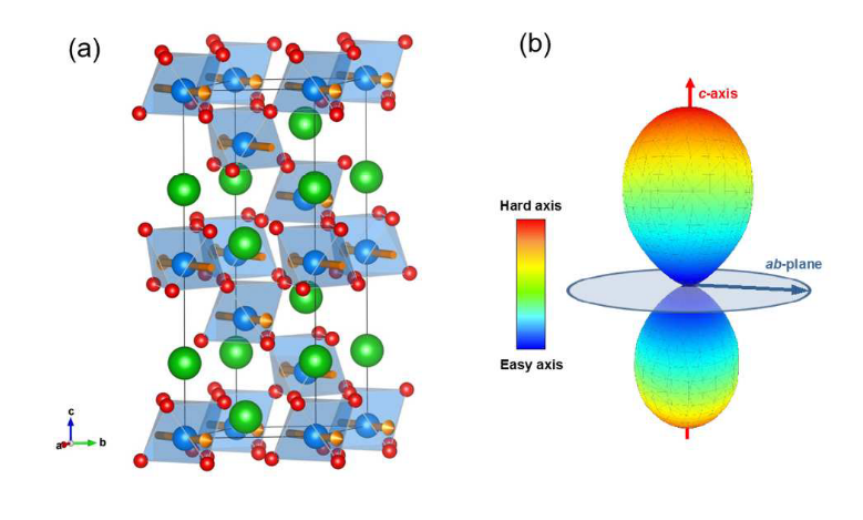
Plotting the unit cell is an obvious choice, since many of these programs require hand-typed input decks. This won't give any unique insight, but it would be a good sanity check.
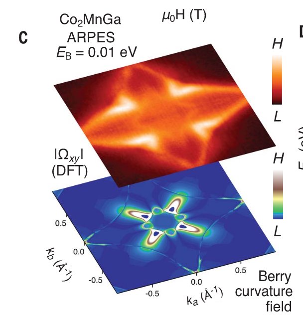
This paper is chock-full of killer graphics; I especially enjoy the Berry curvature field in figure 4c.
