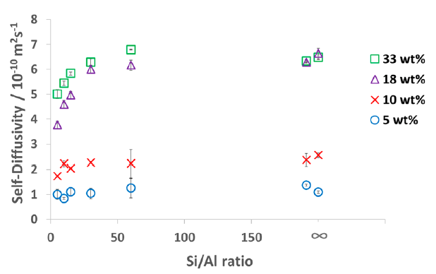
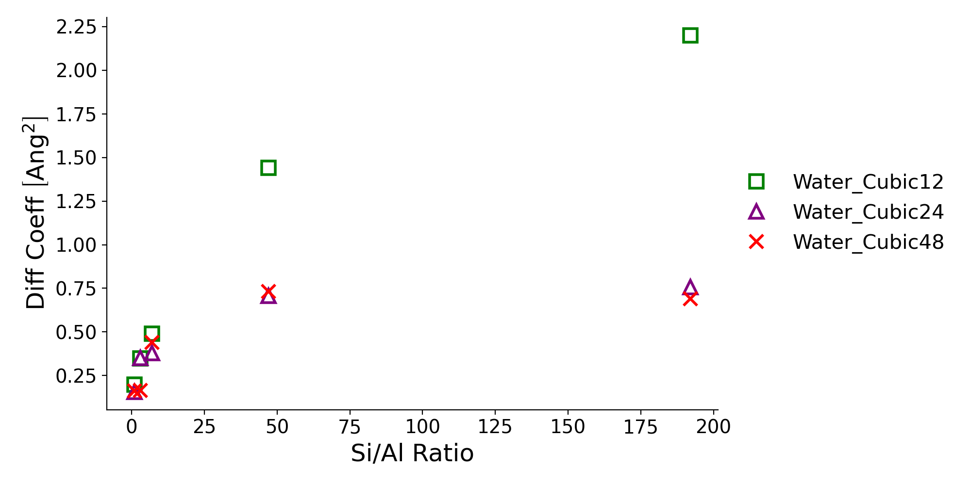
I am planning to use python to get a plot like this  .
.
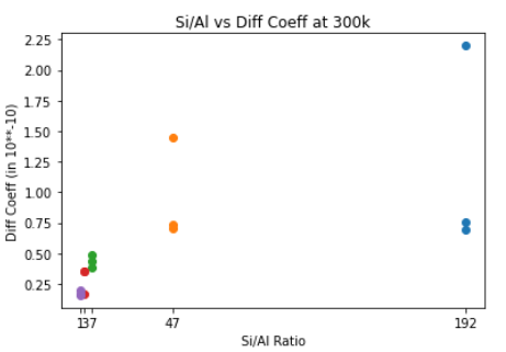
But, I am only able to get this, 
So, I would appreciate it if someone helps me with this issue, (Maybe how to format the data): How to have lower X-axis values highlighted like in the original plot.
Please check the code below and looking forward to your suggestions. Numpy and Matplotlib are being used.
    x = [192, 188/4, 168/24, 144/48, 96/96]
    ys = [[2.20, 0.758, 0.691], [1.44, 0.708, 0.733], [0.491, 0.379, 0.440], [0.349, 0.350, 0.165], [0.199, 0.157, 0.163]]

    print(len(x), len(ys))
    colors = [["r", "y", "g"], ["r", "y", "g"], ["r", "y", "g"], ["r", "y", "g"], ["r", "y", "g"]]
    print(colors)

    for y, x, c in zip(ys, x, colors):
    #     print(y, [x])
    #     print([x]*len(y))
        plt.scatter([x]*len(y), y, color = c)


    plt.xticks([192, 188/4, 168/24, 144/48, 96/96])
    plt.xlabel("Si/Al Ratio")
    plt.ylabel("Diff Coeff (Ang**2)")
    # plt.legend(['Water_Cubic{}'.format(i) for i in [12, 24, 48]], loc=2, bbox_to_anchor=(1.05, 1), borderaxespad=0., fontsize=11)
    plt.title("Si/Al vs Diff Coeff at 300k for Water Content (12, 24, 48)")
